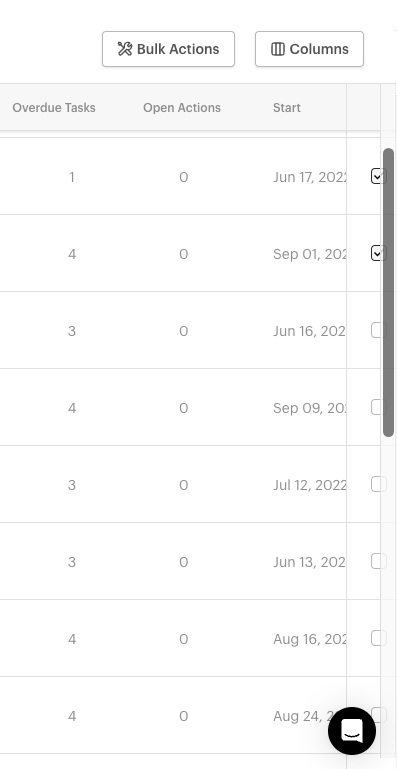
Thanks @emaynez that is a great question. I could very well see us moving the checkbox and select over to the left hand side. I think I would prefer that (and that’s coming from the guy that worked on it). I will say just for your insight and those in the community that there was some thought put into which side and we ultimately picked the right hand side because we have a different table within the product that is being updated (shhh don’t anybody) and the design for the row actions on the table were on the right so we simply copied that idea. So yes, I think the left could be a better spot and we will see what comes out of the design review and how it gets polished before going GA.


